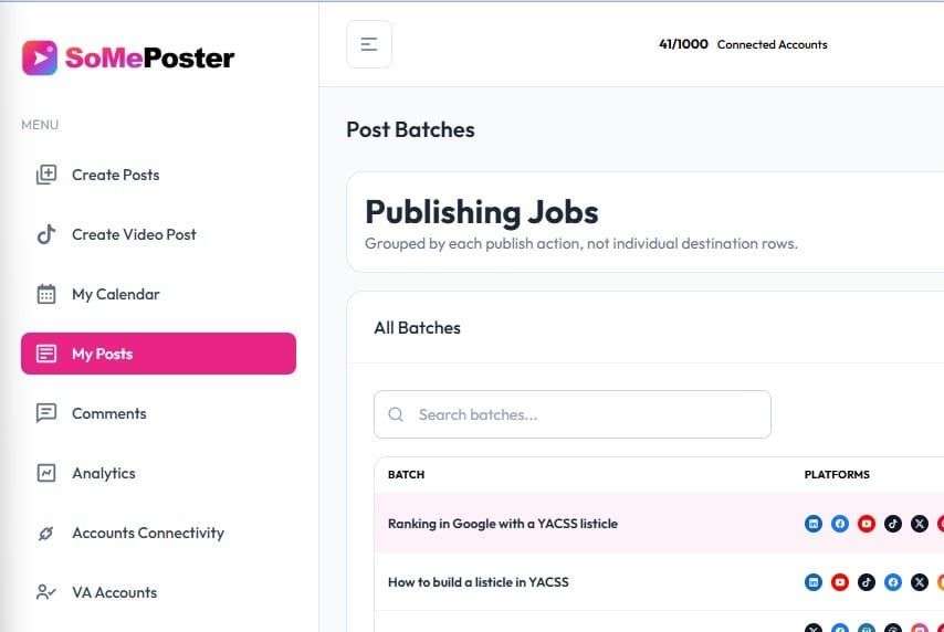
I have spent several days testing and optimizing hover colors and hover effects in someposter.

I started my IT career as a software tester in 2004, in what was called CSC back then. And one of my main things I have focused on since then, is constistency in user interface.
There is nothing more satisfying than a system using the same colors, and the same hover effects everywhere..
In the case of someposter, I have gone with the bright colors and the pink color as the main theme color.
Dark pink for selected button, bright pink for hover...
I like it a lot, its refreshing in contrast to the dark and orange colors, I use in YACSS....
Whats your point of view, you like this bright pink style?
- https://local.google.com/place?id=16287520050048056693&use=posts&lpsid=CIHM0ogKENvDspahvpbr5QE
- https://www.threads.com/@jespernissenseo/post/DYy-dEgjQvo
- https://facebook.com/103644278443424_1621391499998540
- https://x.com/i/status/2059201852969718236
- https://www.pinterest.com/pin/1042161170041703953/
- https://bsky.app/profile/jespernissenseo.bsky.social/post/3mmqnsou6me2t